Graphs
Stage Duration Chart
GoCD provides a chart on the stage details page which can be used for trend analysis of the stage’s periodic runs. This graph shows two line graphs, one each for passed and failed stage instances which are plotted using the total duration of the last 300 stage instances.
To navigate to the Graphs:
- Click on the stage bar of the relevant stage on the pipelines dashboard.
- Click on the tab ‘Graphs’.
Features of the Graph
The following is a snapshot of a stage duration chart
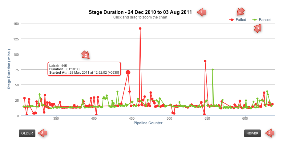
Selecting a part of the graph zooms into the selected area. Once zoomed, a link called ‘Reset Zoom’ Appears on the chart which resets the graph.
Key:
- The title shows the start and end dates of the range of the chart.
- A tooltip giving the details of the stage run appears on hover over the points of the line graph.
- Navigates to the Chart of older 300 runs.
- Navigates to the Chart of newer 300 runs.
- Toggles the line graph of the failed runs.
- Toggles the line graph of the passed runs.
 Suggest edits to this page